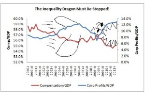
Check out the Inequality Dragon in this graph:

Corporate profits have not only recovered their post-recession highs, they’ve surpassed it. Yet workers' wages are reaching new lows.
If you recall, the data that was presented in this graph illustrated how corporate profits are reaching record highs while workers’ compensations (paychecks) are reaching new lows. Via the Christian Science Monitor:
As you can see, corporate profits have not only recovered their post-recession highs, they’ve surpassed it. And compensation as a share of the economy is far lower. You can also compare how different these patterns look compared to last recession in 2001, when the income shifts were not nearly so sharp.
It’s truly a picture of two very different economies, one for those who depend on their paychecks and one for those who depend on their portfolios.
Here’s the original graph that was released by the Bureau of Economic Analysis before the doodles that revealed the now famous ‘Inequality Dragon’ that broke down the compensation vs. corporate profits per Gross Domestic Product (GDP):
 This would be funny except this is NOT a fairy tale. This is one real dragon that does exist and needs to be slayed or it will eat us all.
Update: here’s the runner-up graph. It breaks down the “We’re Broke” lie.